Author: Rhoda Parry
Brace yourself! Brown is back big time. Throwing off its retro reputation thanks to the ‘warm minimalism’ interiors’ trend of 2023, we’re happy to report that this redefined home decorating hue is having a renaissance on home buffs’ mood boards everywhere. Beware, though, it’s not any-old school-shoe brown that we are talking about. These are luxe, indulgent and sensorial choices that will elevate your interiors to the next level.
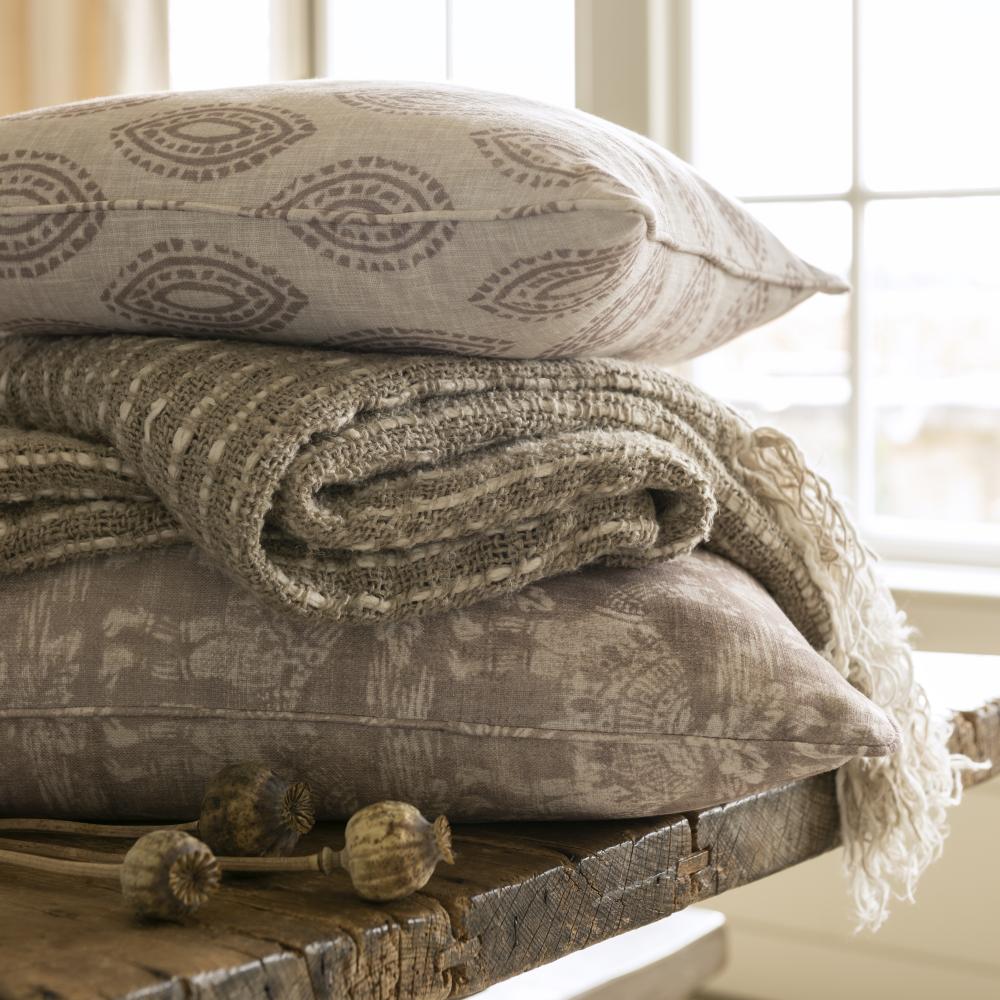
“It's the classy deep tones of mocha and espresso and the suave mid-tones of taupe, stone and linen that are getting home stylists and influencers in a spin!,” says Steve Forder, Director of The Pure Edit. Shown are cushions in Marra Taupe Printed 100% Recycled Cotton Fabric and Toubkal Taupe Printed 100% Recycled Cotton Fabric. So what’s the right brown for your home? How and where do you use it? We dig deep to give you the answers….
How to use brown hues in your home
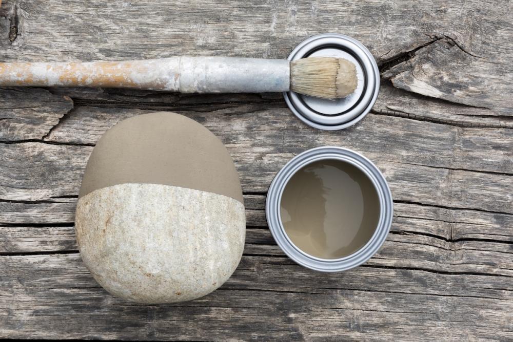
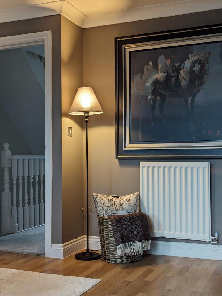
Ask a colour psychologist about the emotional effect of brown on our interiors and they’ll say it’s reassuring, grounded and stable. It reminds us of the beauty of the natural environment, but also the feel-good effect of our must-have morning latte and that secret nibble of rich dark chocolate at midnight. So, it’s no surprise post pandemic, that browns, such as Burford Stone (Shown), are fashionable once more for both country and town decor schemes.
When you look closely at brown, you’ll see that it is a magic mix of three primary colours – red, blue and yellow. Used in varying proportions, with a dose of black or white, you’ll achieve the alchemy of golden browns, such as tan and caramel, the red browns, of cinnamon and terracotta, and the moody browns with a hit of coffee or patina of black.
Brown is long renowned as a stalwart accent for its neutral cousins stone, ivory or warm white. For instance, a painted door and its trim; a real wood floor; or a handsome kitchen table. But the breaking news is that the braver browns are also now hailed as a hero colour, or the main one used, in a room. This confident thinking comes off the back of colour drenching, a look where all the surfaces in a space are the same for an immersive and cocooning effect.
We share six delicious fixes to decorate with the many shades of brown… all styled with the best sustainable and most environmentally friendly paints, papers and fabrics.
Go on a journey with red brown
Credit:@nicolahuthwaite
The powderry red browns are enriching to live with. Reminiscent of Moroccan spice bazaars and dusty Andalusian landscapes, cinnamon, sienna and cinnabar are the ones to seek out for a mature, life-well-travelled vibe.
Used as a painted wall backdrop, these warm style browns will radiate gentle heat into a cool or tall space. Take your colour up to ceiling height and consider painting the skirting for a high-end look that won’t overpower.
If you’re a lover of stone or warm white neutrals, punchy rust accessories will lift and add visual interest. Look at cushion designs with hand blocked motifs and discreet stripes, such as Aline Rust cushion and Folia Cinnabar cushion (shown), that will sit happily on loose-covered sofas and fringed footstools, as seen here in @nicolahuthwaite’s sitting room.
Immerse yourself in mocha brown
Credit:@lottiebownhome
A mocha brown has a canny ability to totally reinvent a small and light-poor space. Rich and chocolatey, it will absorb cold light and switch up the ambience one hundred fold.
Consider an accent or panelled wall, maybe around a fireplace or behind a sofa, or go all over on all four walls. @lottiebownhome dipped her paintbrush into Sable Island Paint (shown), a warm and timeless mocha with generous taupe accents, for her drop-dead gorgeous living room revamp in Cheshire. The result? A foxy movie-watching space that will work in all seasons.
You may be surprised to know that off-blacks are good companions to this alluring brown so use it on woodwork and picture frames, lighting and furniture to build a layered and magnetic look.
Hang out with linen brown
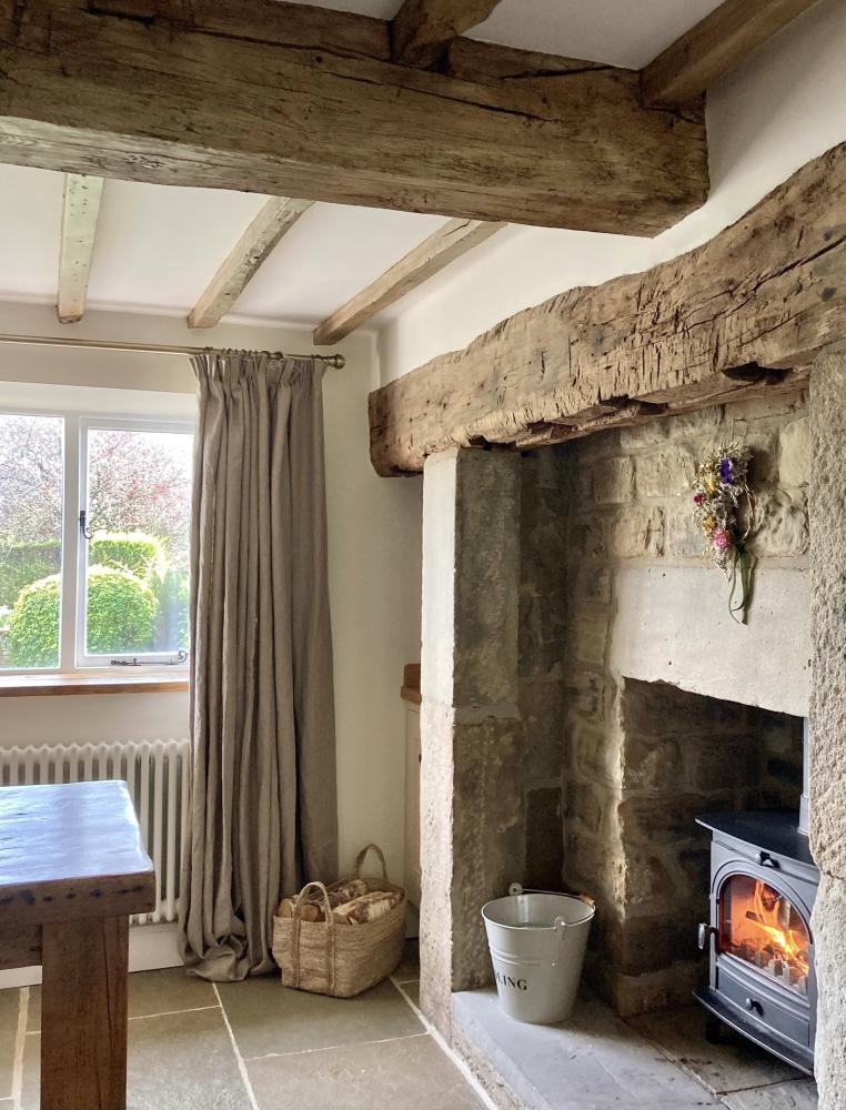
Credit:@life_at_the_mews
Totally tonal linen browns aren’t going anywhere you’ll be pleased to hear. For those of us who love the cottage core aesthetic, this flax-derived palette is our forever go-to. These charming browns are the nuts and bolts of an old-house room scheme working seamlessly alongside rustic beams and golden-hue stone fireplaces.
,@life_at_the_mews opted for Flanders Natural pencil pleat lined curtains (shown) for the windows of her dreamy Yorkshire dining space. Made from 100% linen with an effortless drape and organic look, they won’t distract you from the view beyond. Alternatively, opt for unlined semi-sheer linen curtains to give a floaty and romantic air to garden rooms and bedroom spaces.
Tonal schemes need to go all-out on textures, so look to bronzed metals, woven basketry and roughened furniture to keep the look upbeat and interesting.
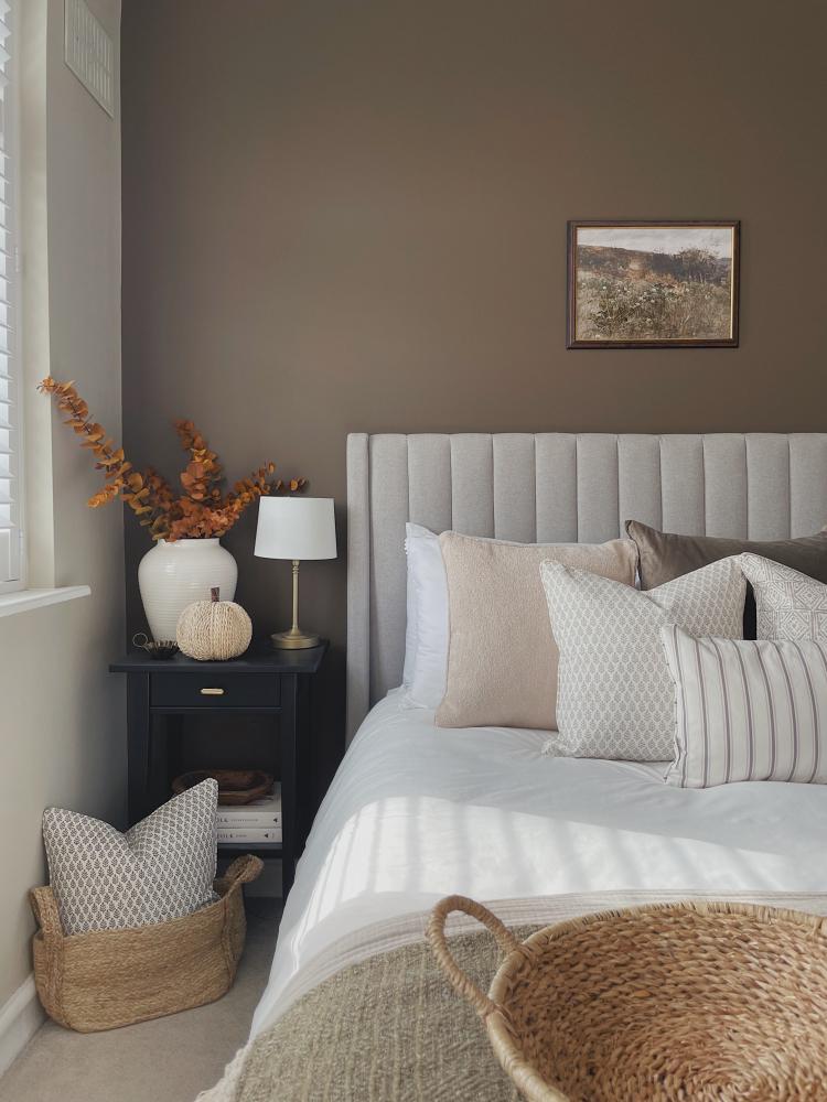
Sleep well with mineral browns
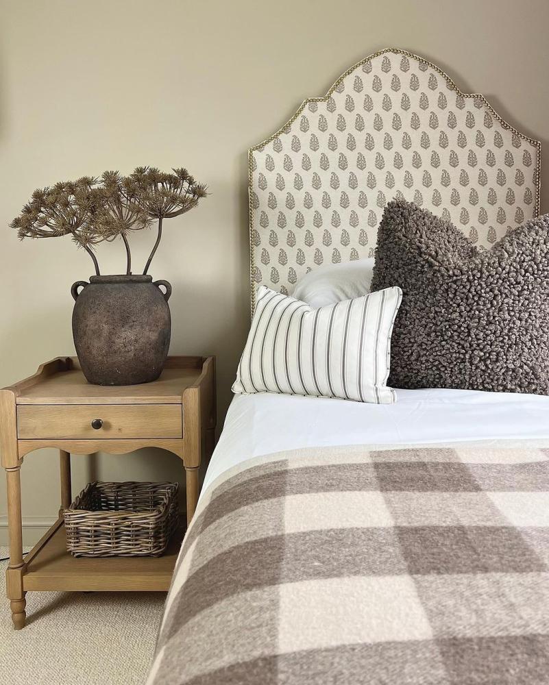
Credit:@_homeofvictoria
Mother Nature’s mineral browns ground and calm all manner of home styles – from sleek city flats to family suburban semis. If you’re aiming for a serene all-brown scheme, work your look from light to dark for attractive visual cues that will appear pleasing to the eye.
Indira Stone Izzie Headboard (shown) makes a good starting point for a scheme as seen here in the Suffolk home of @ _homeofvictoria. The paisley fabric is printed with a hand block appearance inspired by the design’s Indian influences.
Echo the tones from stone through to amber, earth to truffle on varying pieces, patterns and textiles. Mingle classic cotton ticking, as seen here on Malika Espresso cushion, with nubbly sheepskin style pillows and country check wool throws.
Glam up a space with brown-green
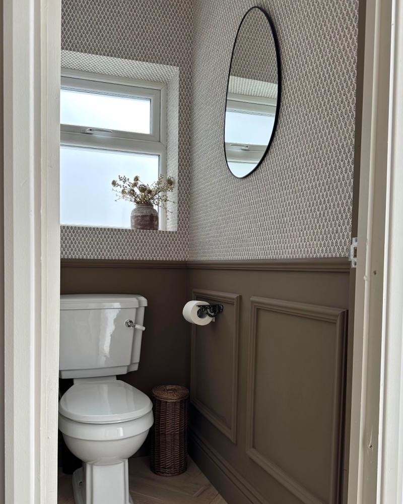
Credit:@the_house_at_twenty_six_
Cocoa brown and olive green pairings have been an all-out success on the catwalk and have followed through into interiors. The secret is to match colour blocks of one with a pattern of the other for a seriously stylish top-to-toe result.
Experiment by redefining a powder room; functional spaces deserve to look like a million dollars. In the terraced Kent home of @the_house_at_twenty_six_, an unloved downstairs loo was given the five-star treatment with a small-scale leaf repeat wallpaper called Folio Espresso (shown). River Otter Paint, a contemporary mid-brown with olive undertones, covers the dado-height panelling and door.
To help bounce the light around a bijou space, coordinate with crisp white highlights and reflecting glass mirrors.
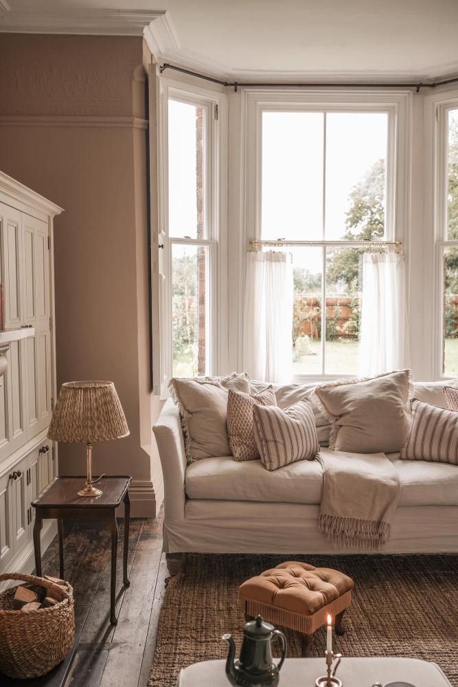
Line up for taupe
Credit:@homewithfran
Taupe falls somewhere between beige and grey. It’s a catch-all mute that makes a nuanced coordinate in quiet spaces, such as bedrooms, where you can play with bedding, blankets and cushionscapes to create a seasonal and sleepy atmosphere.
Snuggle up taupe with blush, clay and brunette on geos, stripes and plain fabrics. Styled by @homewithfran, Ellora Taupe cushion, Malika Espresso cushion, Folia Espresso cushion and Folia Stone cushion make happy bedfellows in her Herefordshire home.
So there you have it. Brown in all its many guises and glory. Here at The Pure Edit, we know you love a neutral, so we hope this has inspired you to experiment with new, daring and interesting shades across paint, wallpaper, fabrics, furniture, cushions and bedding. Our mantra is ‘planet-positive style for every home’ so head over to the website where you’ll find an unrivalled collection of sustainable home designs. Start planning your dream scheme today.

About the author
Rhoda Parry
Rhoda Parry has spent her media career reporting on the best of interior design and decor. Former Content Director of Ideal Home, the UK’s best-known media brand, Rhoda is a seasoned journalist with a nose for what's new, now, and forever in the world of homes.