Blue – it’s the colour of skies, seas and all things relaxing. As a universal colour long associated with tranquility and reassurance, blue is the go-to palette when considering a home redecoration project. Why? The simple answer is it works! Just like a great pair of jeans, a blue look is the one to reach for if you are after never-out-of-fashion longevity.
“Blue decor is effortless for both classic and contemporary interiors,” says Steve Forder, founder of The Pure Edit. “It offers an infinite choice of dark, mid and light tones that can feel warm or cool, smart or informal, depending on the vibe you want to create. All are easy to live with.”
In this article, we take you on a journey to explore how to incorporate this perennial favourite into your decorating schemes, plus inspire you with five out-of-the-blue switch ups using sustainable paint, fabric, curtains, blinds and wallpapers.
How to use blue hues in your home
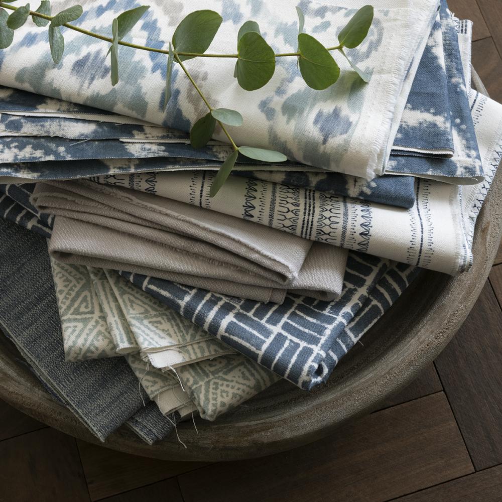
Of course, there are a myriad of blues from deep and cocooning to airy and barely there. Before deciding on your favourites, here are three need-to-know home style tips…
Firstly, what atmosphere do you want to create? Think of the blue palette as a character builder. Do you want a room that is smart and tailored? In which case, the deep darks such as indigo and ink will tick the box. A space that is relaxed and easy to live in? Then the warm mid blues – denim and marine for example – will put you at everyday ease. Peaceful and meditative? Seek out the light and cool blues of sky and chambray. Or for something with energy and vibrancy, head to the jewel blues: cobalt, turquoise and azure.
Secondly, be aware of the orientation of your room and how much natural light enters it. Blue has the inherent ability to feel warm or cool depending on the tint (blue plus white), tone (blue plus grey) or shade (blue plus black) you choose. North facing rooms that get little sun, as an example, won’t benefit from a cool blue (it will just make the room feel chilly), whereas a dark blue will cocoon it. Always get tester pots and fabric and wallpaper samples so that you can be sure you are getting the effect you desire.
And finally, the proportion of blue used in a space is also important. The 60-30-10 interior design rule is a good one to apply when building a scheme. Break down the colour usage into 60% of your primary colour (say, on walls or floors), 30% secondary colour (soft furnishings), 10% third or accent colour (accessories). In a monochromatic room that majors on blue shades, use 60% of your chosen blue, for instance, with a tint, tone or shade as your 30 and 10 percentages. As with all decorating projects, playing with the proportions will create a room that is unique to you and these can then be echoed throughout the different rooms in your home for a unified narrative.
Feeling in the mood for blue? We showcase five fail-safe fixes for the relaxed way of living we know you love…
Make an entrance with blue grey
Credit: @the_creative_saint.
Give walls a lick of blue for a refresh that adds interest, depth and spirit. Choose a blue grey tone, such as Angelite Paint, to act as a neutral base in a scheme. Easy on the eye and elegant, it will form a pleasing backdrop when used in the highest proportion in a space. It makes for a resonant colour in an entrance area and is complemented by white, black, natural woods and dulled golds.
Layer up the blues with delicately decorated soft furnishings in the form of bench covers and cushions as shown in the home of @the_creative_saint where Lotus Midnight fabric (shown) with its hand drawn dahlia blooms and lotus flowers are printed on responsibly sourced cotton.
Layer windows with indigo weaves
Indigo is a timeless classic in an interior designer’s room recipe book. One of the oldest textile dyes, it is an enduring accent plain for rooms with a vintage white bias. You can’t go wrong with lightly gathered indigo curtains in living rooms and bedrooms – you’ll be assured of a look that will add informal volume to glazed areas whether windows or doors. Up the texture quota with recycled woven fabrics, such as Kalinda Indigo Made To Measure Curtains (shown), that have a contrasting yarn for a touch-worthy effect.
Take note… darker blues on window treatments also have the added benefit of reducing light penetration at certain times of the day and additionally make a room feel cosy when the night draws in. Specify blackout with interlining for added heat retaining and light sensitive benefits.
Add denim interest to Roman blinds
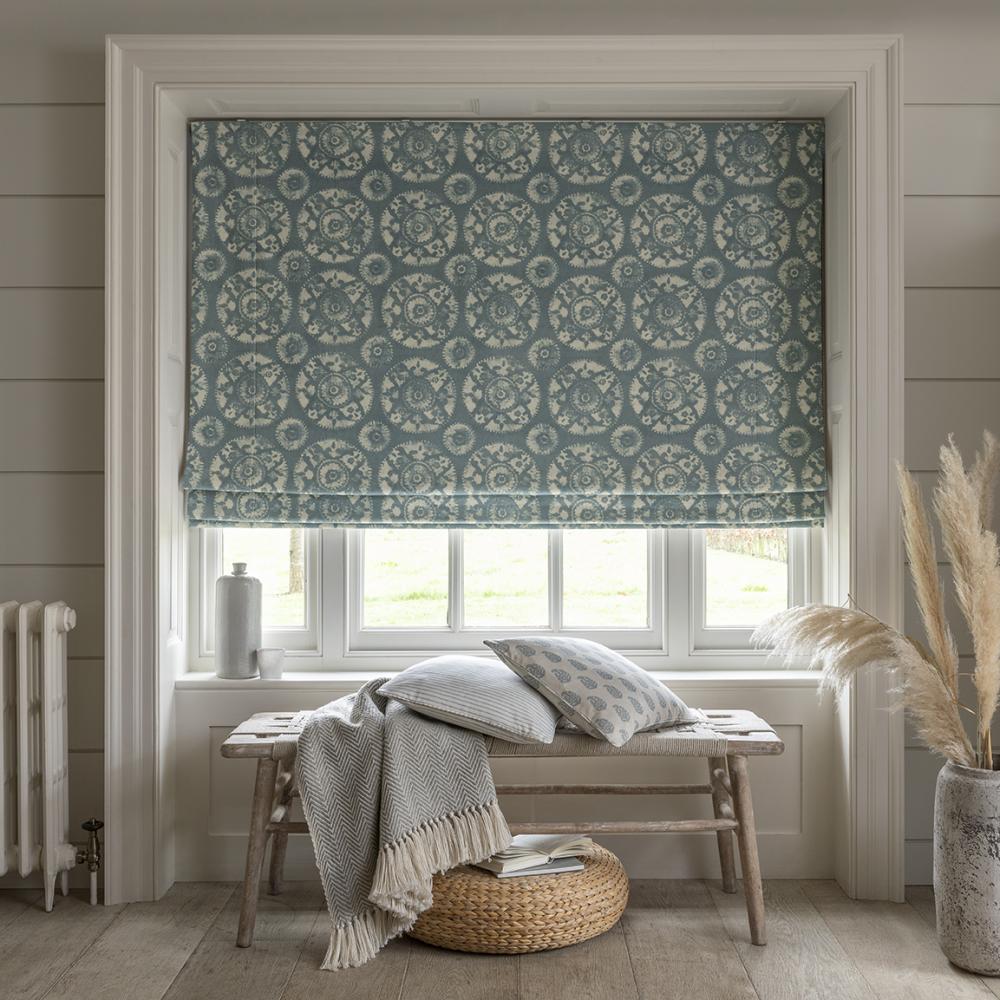
Denim – the cheerful workwear hue – will echo skies and blur the lines between outside and in. Choose this no-fuss blue on Roman blinds to frame a view in downstairs rooms, such as open plan kitchen diners, for a casual and carefree effect at windows.
Nubra Denim Roman Blind (shown) with its hand block printed medallion motif takes its inspiration from antique ceramic plates and is made from responsibly sourced cotton. This blue partners well with stone-coloured paints, blonde woods and woven basketry and is complemented by Cho Sky Printed Cotton Fabric and Indira Chambray Cushion to soften window seats and benches.
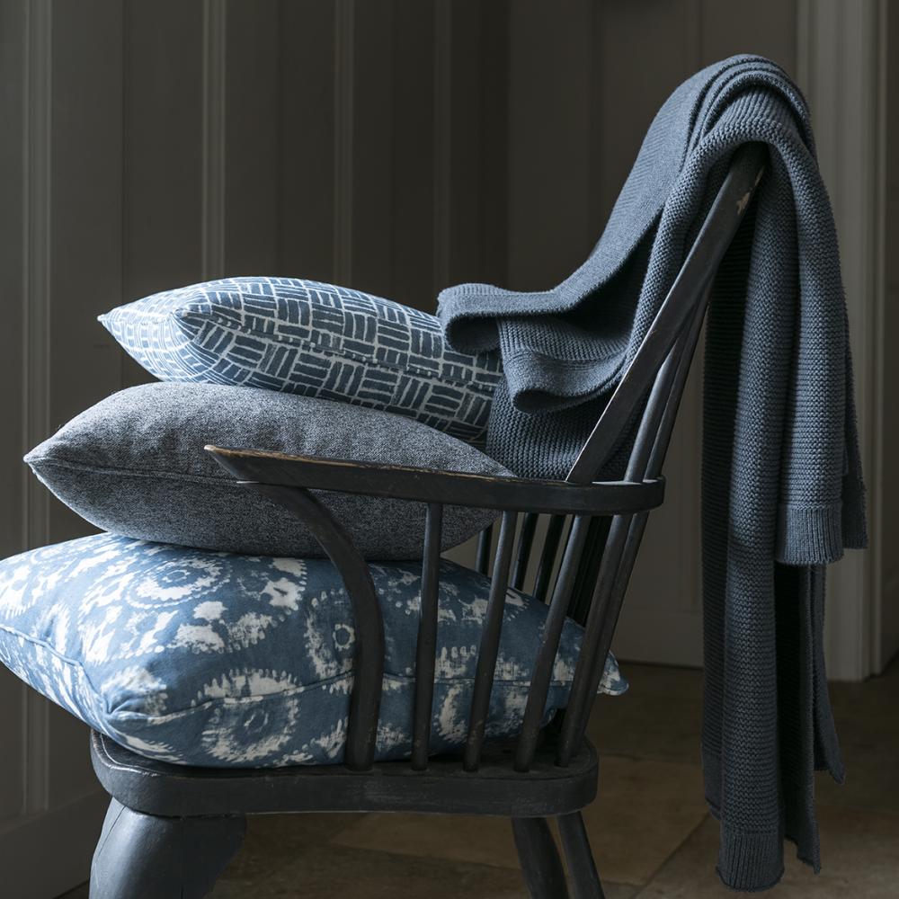
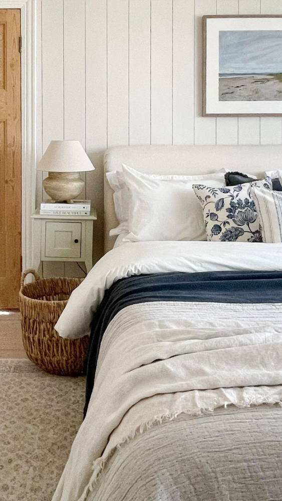
Curate classic blue into cushion collections
Credit: @theoxtobyburrow.
Classic ink florals make a mood-boosting starting point for distinctive cushionscaping. Aim for beautifully drawn depictions of blooms, branches and leaves, that will introduce quiet nonchalance and organic style into a scheme.
For a fail-safe cushion grouping on sofas and beds, start with a hero floral design such as Kamila Indigo Cushion (shown) with its vivid contrast white ground. Then build your grouping with ticking stripes and tumbled linen plains (Bodo Stripe Ink Cushion and Shani Indigo Cushion shown) for a clean and crisp look that’s reminiscent of Scandinavian style.
Echo your chosen blues on artworks, throws, bedspreads and lampshades to keep the theme alive throughout the space.
Wallpaper with charming china blue
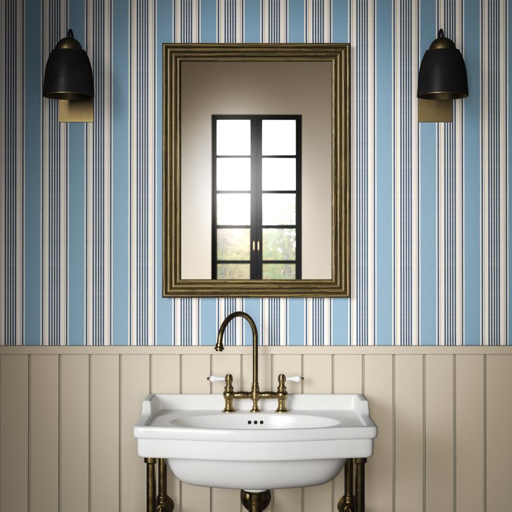
China blue makes an uplifting and charming choice on wallpaper stripes. A soft and endearing blue, it brings a relaxed yet rhythmic repeat to unloved walls. Use upstairs for visual excitement in sweet bijou or attic bedrooms and downstairs on living or restroom surfaces. Just want a quick-fix update? We love to customise the back of bookshelves and inside cupboards using the paper horizontally or vertically.
Look to Nimes China Blue Wallpaper with its Southern France vibes which, when combined with indigo, stone and white, makes a welcome theme for modern country and coastal-inspired looks that combine comfort and an easy sensibility.
Play with azure on drapes
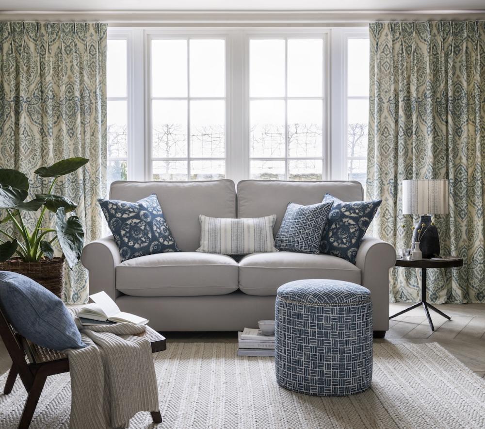
Vibrant blues, such as azure, are the secret to designing sassy, yet easy to live with, patterned room schemes. Window treatments are the primary place to showcase energetic colourways and lively large-scale designs beautifully.
Start your thinking with an exquisite fabric like Suhani Azure Made To Measure Curtains (shown) that features evocative Indian motifs with tonal blues and a contrasting taupe. Draw out the companion blues across the space on upholstered pouffes, occasional chairs, lamp shades and cushions. Remember to ground the room with quiet-colour seating, carpets, rugs and accessories so that the pattern doesn’t overwhelm the eye.

About the author
Rhoda Parry
Rhoda Parry has spent her media career reporting on the best of interior design and decor. Former Content Director of Ideal Home, the UK’s best-known media brand, Rhoda is a seasoned journalist with a nose for what's new, now, and forever in the world of homes.