One of the fundamental choices you’ll make when decorating a home is deciding on its colour palette. For some, it’s easy – a favourite hue is an instinctive go-to – but for many of us the agonising spectrum of colours available makes committing far less easy!
‘A dream interior surrounds you with colours that make you smile,’ advises renowned stylist, Lucy Gough, in her new interior design book, The Home Style Handbook. ‘However, too many colours can feel overwhelming and visually confusing. A small palette of colours and textures is the key to every successful space.’
Developing a colour consultant’s eye is a fun and creative process that we can all lean into. In this article, we give you the wisdom on colour theory, how to use the colour wheel to create three harmonious schemes, plus share design tips for the perfect look across paint, wallpaper, fabrics and accessories.
Make friends with the colour wheel
We all see colour differently, so knowing the basics of colour theory can give you a real understanding of how to choose and use it in your home. Let’s start with the colour wheel…
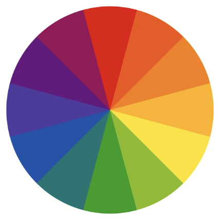
This classic 12 segment circle is a visual representation of the light spectrum and underpins the fundamental way we think about colour in interior design. The wheel is made up of: primary colours (yellow, red and blue), those that cannot be made by mixing other colours; secondary colours (orange, violet, green), each made by mixing two primary colours; and tertiary colours (yellow orange, red orange, red violet, blue violet, blue green, yellow green), each made by mixing a primary colour with a secondary colour. It’s like looking at the rainbow.
Where are black, white and grey in the mix, you may ask? Well, these are regarded as non-colours. Their role is to act as neutrals in a decor scheme, but also to create tints (the original colour plus white), tones (the original colour plus grey) and shades (the original colour plus black) depending on the proportion that is added.
Master harmonious colour schemes
So what does this mean for room designs? Well, by understanding where a colour sits on the wheel, and its relationship to others, you’ll be one step closer to styling a great-looking home. Choose one of these three fundamental schemes for colour decorating harmony…
A complementary scheme. This is made up of colours that sit opposite each other on the colour wheel. It’s regarded as a high contrast pairing, such as red and green, or blue and orange, and will result in a space that is visually stimulating and gregarious. This look is a favourite of maximalists and colour drenching converts. Balance is key when using this combination and you can keep it in check by varying the tones of the complementary colours.
An analogous scheme. This uses colours that are adjacent to each other on the wheel, such as blue, blue-green and green. Because they sit next to each other, the eye finds them pleasing and comfortable to look at. Often associated with nature, this scheme feels at home in relaxed, easy-going and country-style room schemes.
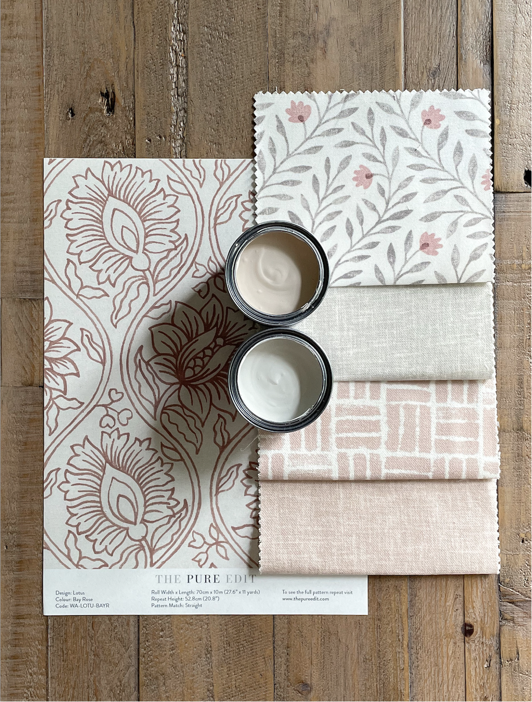
A monochromatic scheme. This is a one-colour combination used in varying tones. As a result, it’s calming to live with. People wrongly think this term refers to black and white. But that’s not the case. It can be any colour, as shown here in pink with Lotus Bay Rose Wallpaper complemented by Yasmina Petal Printed Cotton Fabric, Atlas Rose Printed Cotton Fabric, Pascal Shell Printed Cotton Fabric, and finished with soft pink and off-white paint hues.
Design tip… Make a digital mood board based on one of the above. Include screen grabs of fabrics, wallpapers, paint, furniture that highlight your combinations.
Understand colour moods

Every colour comes with its own persona and, as result, is a powerful tool when thinking about the atmosphere it creates. A bit like people, each has its own set of characteristics – some are hot and fiery, others restorative and quiet. According to the psychology of colour, blue is connected to tranquility and peace; red is active and exciting; pink, feminine and sensitive; green, fresh and natural; yellow, cheerful and optimistic; and orange feels stimulating and creative.
It’s worth considering intensity. A saturated colour brings with it brightness and purity and is the opposite of a muted colour. The colour wheel also groups together the hues that are regarded as warm (reds, oranges and yellows) and cool (greens, blues and violets). Warm colours, or advancing colours as they are sometimes called, have the effect of bringing surfaces in closer. They feel cosy and cocooning. Cool, or receding colours, make a room appear bigger and thus lighter.
Have a think about the function of the room and the related colours that will give you the vibe you are aiming for. For instance, a golden yellow is embracing and uplifting and would be a good complement in a busy family kitchen diner. While a soft olive will feel hushed and peaceful in a sanctuary-style bedroom.
Design tip… Paint colour swatches onto old envelopes or cardboard. Stick them onto walls and then live with them for a while to see how they make you feel.
Know the joy of neutrals
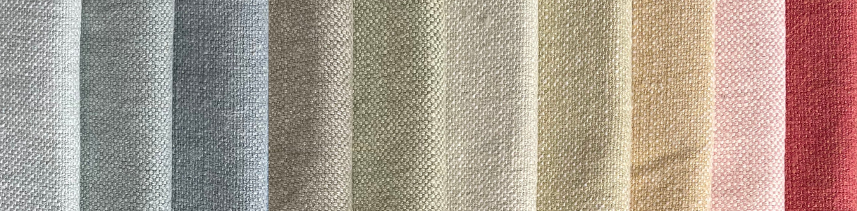
For many home decorators, neutral colours are the base layer of a room. They go with each other and also everything else! Ranging from black, brown and graphite to soft grey, taupe, cream and white, there are a myriad to choose from – some cool and some warm – and many ways to apply them.
Large surfaces, such as walls and ceilings are often the go-to destinations with upholstery coming in a close second. You can then layer up with accent colours based on your colour wheel choices that will contrast or complement on window treatments, cushions and accessories.
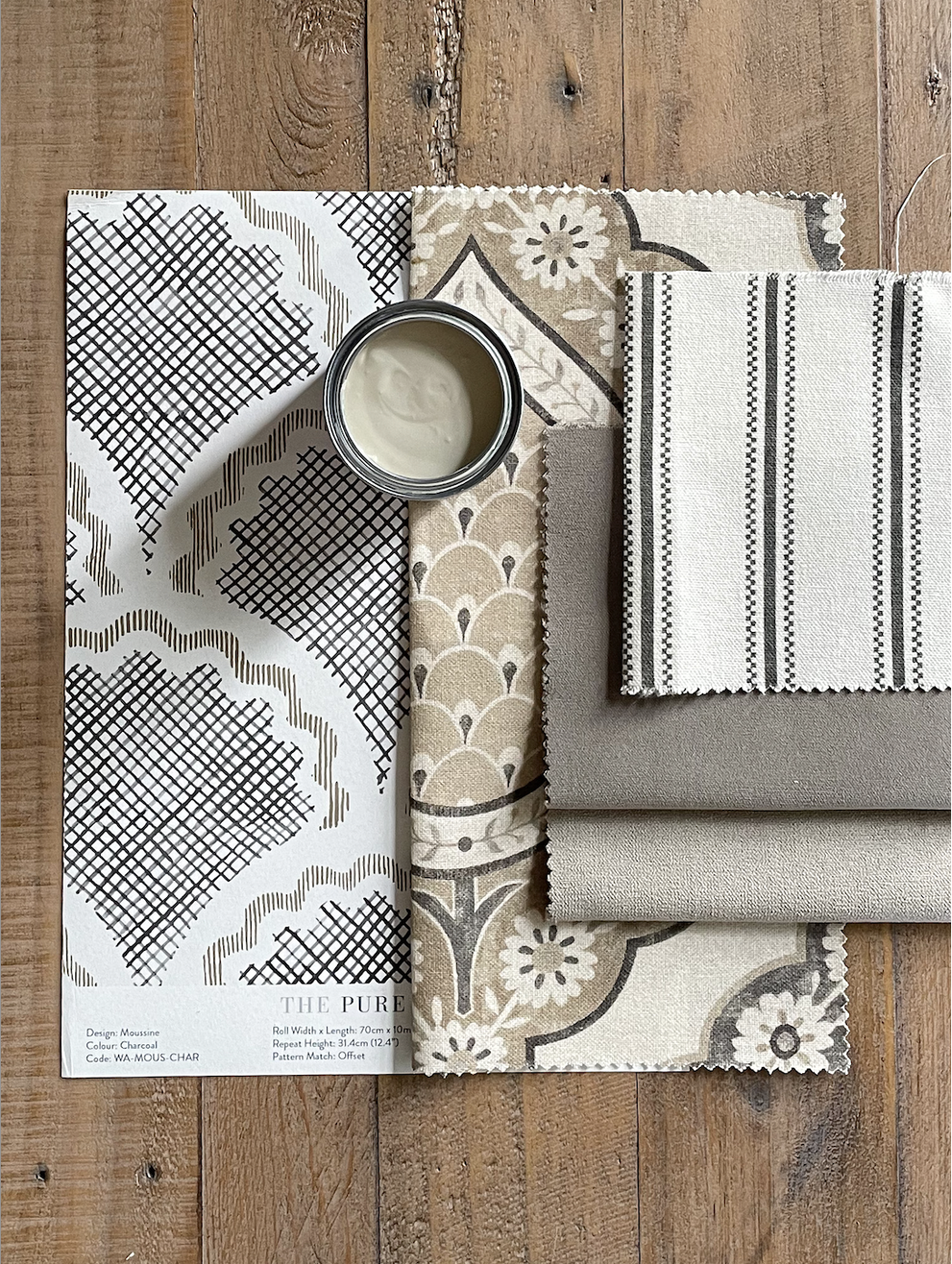
All-neutral rooms are currently in vogue thanks to the “quiet luxury” trend, but beware of the bland factor! Inject pattern and pace for a sophisticated and successful scheme, as shown here with Moussine Charcoal Wallpaper, Indienne Espresso Recycled Cotton Fabric and Aline Charcoal Printed Cotton Fabric.
Design tip… Introduce organic textures for added interest. Include nubbly fabrics like linen, boucle and wool, rough-hewn woods, aged metallics and leather detailing.
We hope this teach-in has given you an insight into how colour and its many properties can take your home to the next level. Once you’ve decided on the right harmony, think about how hues can echo through a space and, indeed, the whole home. Here at The Pure Edit, we like to make it easy for our customers, so head over to the website and filter by colour to see an unrivalled collection of wallpaper, fabric, furniture and accessories. Then create a moodboard by ordering four free samples. Still stuck? Remember, you can speak to our super-friendly interiors’ team who know all about designing a home for good.

About the author
Rhoda Parry
Rhoda Parry has spent her media career reporting on the best of interior design and decor. Former Content Director of Ideal Home, the UK’s best-known media brand, Rhoda is a seasoned journalist with a nose for what's new, now, and forever in the world of homes.